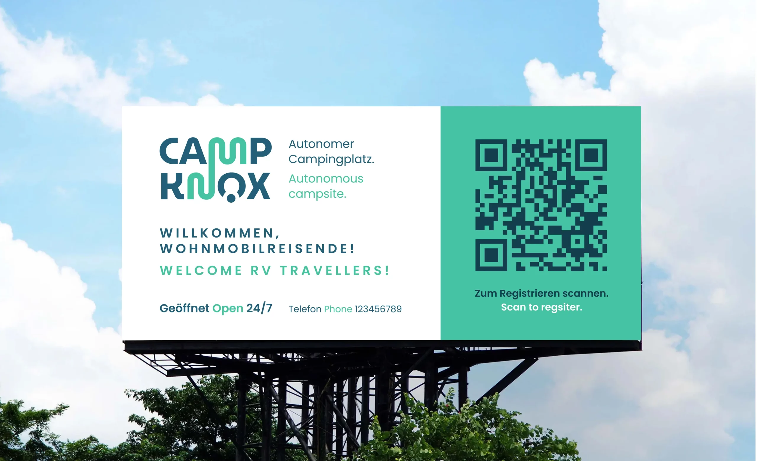
Designed for the stop.
A new generation of motorhome parks, where the freedom to travel meets the reassurance and comfort of a welcoming arrival.
Identidade da Marca · BrandGuide · Storytelling · Design de Comunicação
A brand that brings smart, self-service stays to life, conveying trust, simplicity and a warm welcome to motorhome travellers.
Challenge
Building trust before arrival.
CampKnox was created to meet the needs of people who embrace life on the road: families, retirees and nomads seeking freedom, alongside a safe, comfortable place to stop.
The offering combines self-service access, modern infrastructure and services designed to make each stay straightforward. What was missing was an identity that made this value visible and connected with travellers.
The challenge was to express two complementary needs: the independence to keep travelling and the reassurance of knowing what awaits at the next stop. The brand needed to communicate innovation and safety while feeling approachable and welcoming.
Approach
Freedom on the road. Confidence at every stop.
The process began by defining the brand’s attributes and positioning, exploring both travellers’ practical needs and how they want to feel on arrival: rested, reassured and ready for the journey ahead.
The narrative was built around the stop as part of the adventure itself. A moment to recharge, with the reassurance of finding a well-prepared space and services that work.
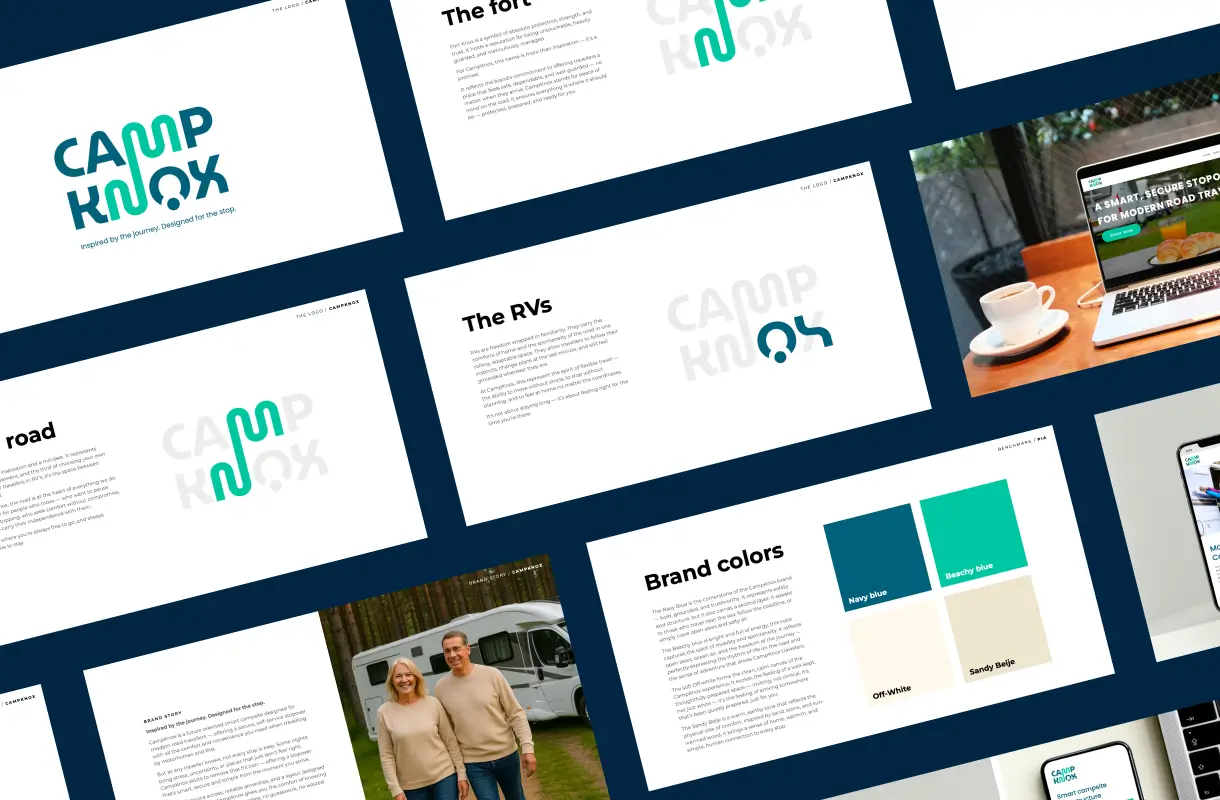
To express this visually, I explored four references: the protection associated with Fort Knox, the freedom of the road, the familiarity of a motorhome and the comfort of a place to stop.
These references shaped a visual language that balances structure and movement, solidity and warmth — supporting an experience designed to feel straightforward from arrival to departure.
Solution
An identity that gives us the confidence to stay.
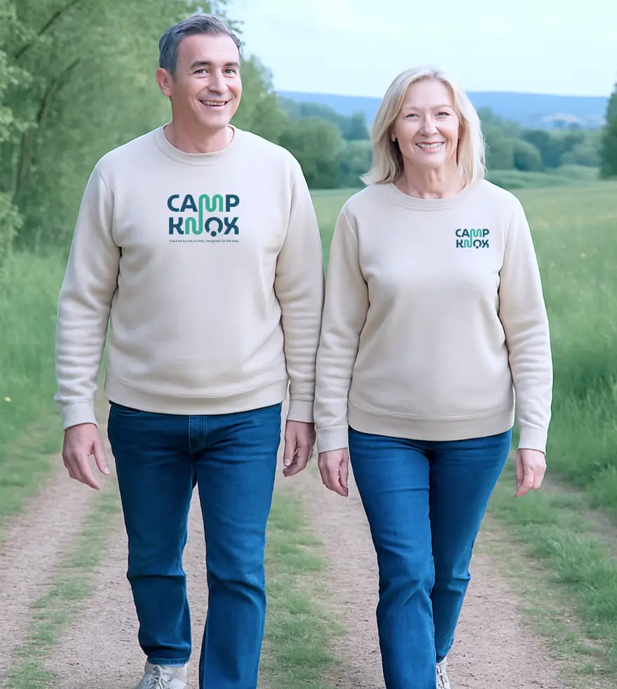
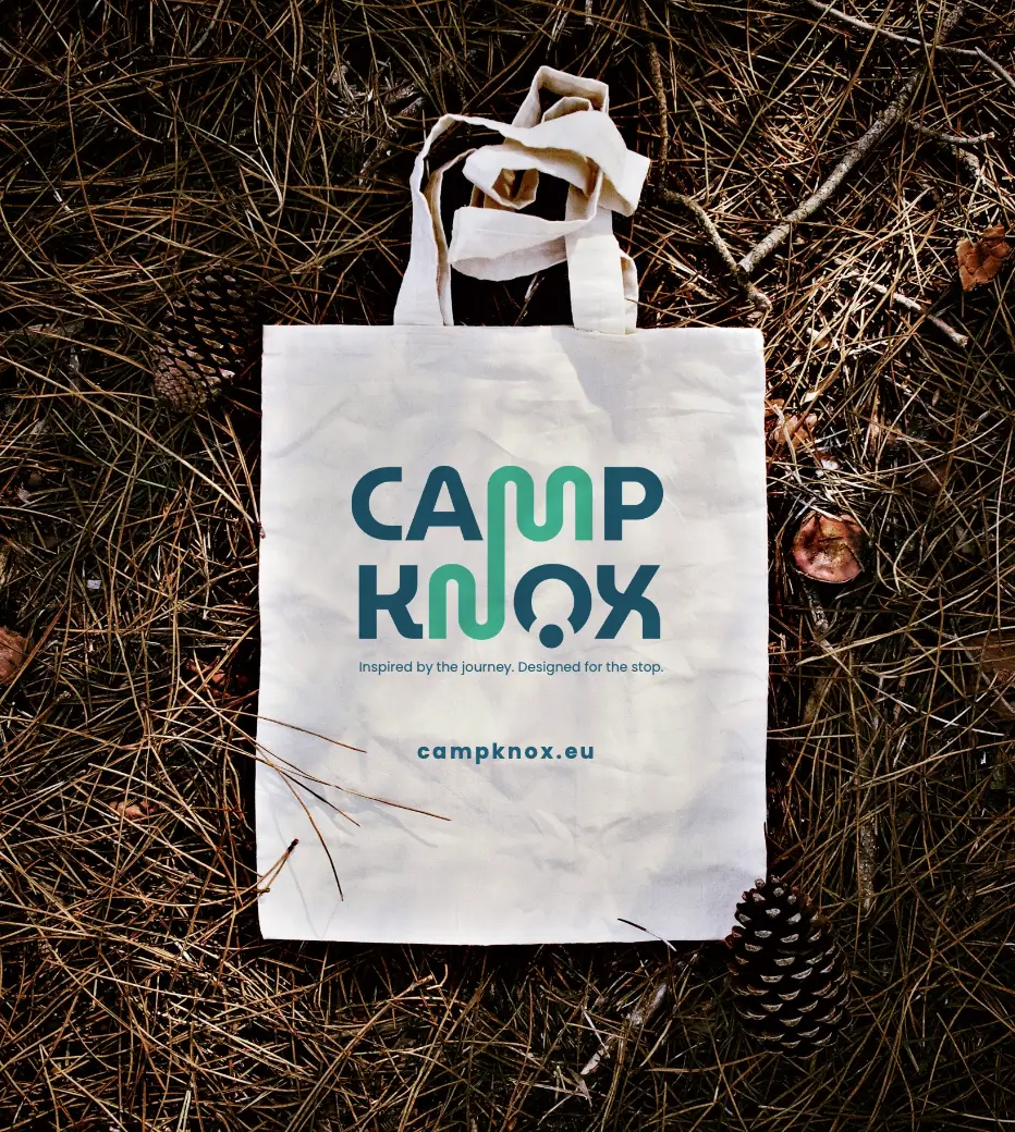
I created a visual identity that brings together the key elements of CampKnox’s world: the road, the fort, the motorhome and the stopover space. Together, they express the promise of travelling freely and stopping with confidence.
The bold, uppercase lettering conveys stability and safety, while its soft curves add familiarity and warmth.
The palette extends this balance: dark blue provides structure and trust; brighter blue evokes open skies, movement and adventure; light and sandy tones bring calm and comfort.
The tagline “Inspired by the journey. Designed for the stop.” captures the brand’s central idea. The identity and its applications present CampKnox as a stop designed for people who want to keep exploring — with less uncertainty and greater peace of mind.