Circular by nature
An identity created for a platform connecting businesses, resources, carbon and sustainable investment.
Brand Naming and Narrative · Brand Identity
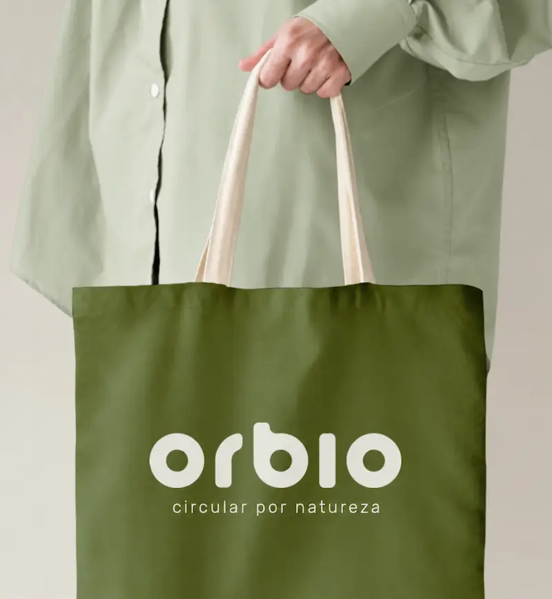
A brand connecting circularity, carbon offsetting and green finance, expressing a commitment to regenerating the planet.
Challenge
Bringing clarity and value to a complex proposition
Orbio was founded with the ambition of enabling a more circular, regenerative and low-carbon economy, connecting businesses, materials, carbon credits and sustainable investment opportunities.
The project brought together several dimensions in a field where communication requires particular care: complex services needed to be explained, trust established and sustainability made tangible, without resorting to overly technical or generic language.
The lack of a consistent identity made the proposition harder to understand and did not yet reflect the brand’s value, maturity and ambition.
Approach
Building a brand around the idea of a cycle
The process began with naming and positioning.
Among several possibilities, Orbio emerged: a combination of orb — world, circle, planet — and bio — life, biological, organic.
The name brought together two central ideas: life as a cycle, and the meeting of technology and natural systems.
From there, I developed a brand narrative centred on circularity, regeneration and an infrastructure connecting different participants and resources, allowing materials, capital and impact to circulate once again.
Solution
A visual system expressing circularity
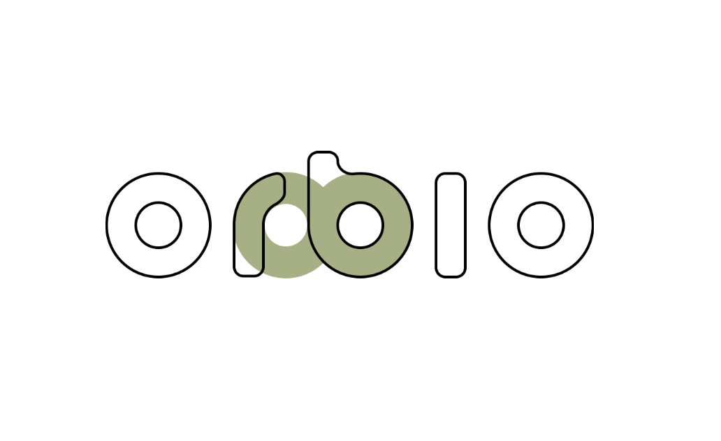
The identity was developed around the circle as its foundational element.
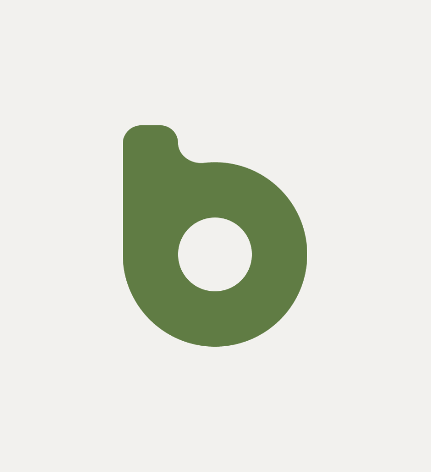
The symbol uses a continuous loop to express transformation, return and regeneration — the idea that a resource can find new life and re-enter the system rather than go to waste.
Three circles represent Orbio’s three pillars: reusing industrial waste, offsetting emissions and financing sustainable projects. Separately, they represent different solutions; together, they form a single ecosystem.
The lettering itself was constructed from circular geometry, extending the concept of circularity into the letterforms and making it an integral part of the brand’s visual language.
Olive green adds a sense of maturity and permanence. Inspired by the olive tree, it conveys balance, trust and a long-term outlook, moving the identity beyond the more predictable visual conventions associated with sustainability.
The result is a brand that translates a complex system into a simple, coherent visual language: technology, circularity and regeneration brought together in an identity that communicates both purpose and credibility.