From fear to flow
An identity and digital presence for a project that transforms our relationship with water, the body and the ocean.
Web Design · Brand Identity · Brand Strategy
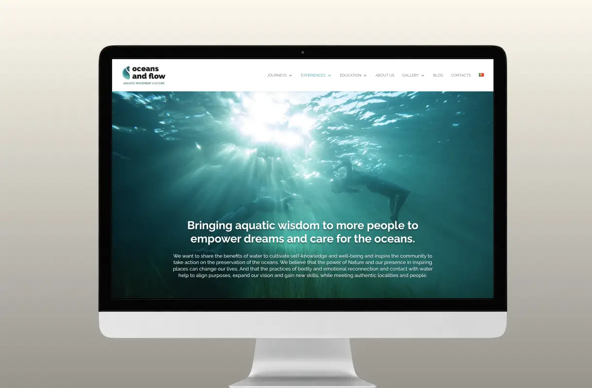
A brand experience that captures the sensory and emotional world of Oceans and Flow with clarity and depth.
Challenge
Giving shape to a vision still taking form
Oceans and Flow grew out of Violeta Aguiar Lapa’s personal story and her transformative relationship with water. After decades of fearing the ocean, Violeta learnt to swim and dance underwater, inspiring a project dedicated to aquatic movement, ocean exploration and reconnecting with nature.
When we began working together, the project encompassed many ideas, concepts, experiences and intentions, but lacked a simple, clear way to organise and communicate them.
The challenge therefore went beyond creating a visual identity or a website: it meant understanding the project’s essence, identifying what it truly offered people and turning an abstract, innovative vision into a proposition people could understand and navigate.
Approach
Finding clarity without losing depth
The process began by immersing myself in the world of Oceans and Flow: the connections between water, movement, nature, travel, personal transformation and ecological awareness.
Concepts needed organising, a hierarchy establishing and a language developing that could communicate the depth of the vision while remaining accessible to people encountering the project for the first time.
From there, I developed the identity and digital experience as parts of the same narrative. The brand needed to convey fluidity, depth and a connection to life, while helping people understand the experiences and programmes available.
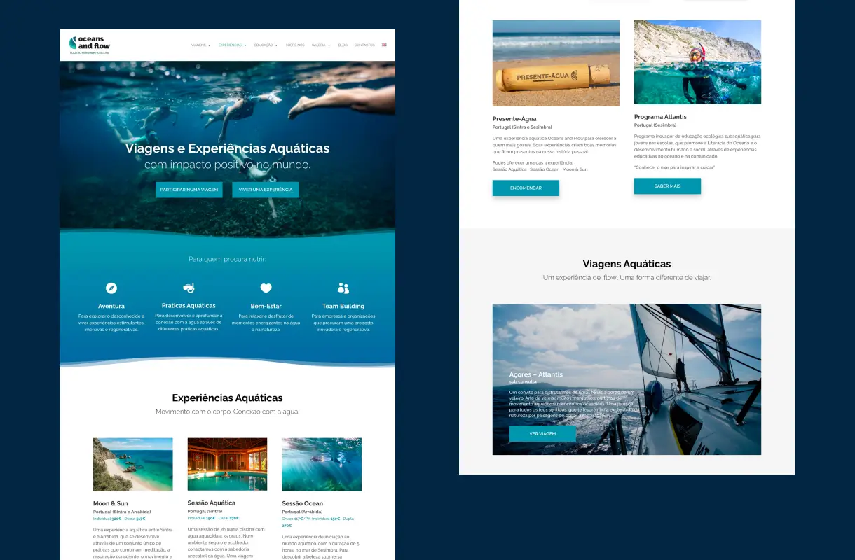
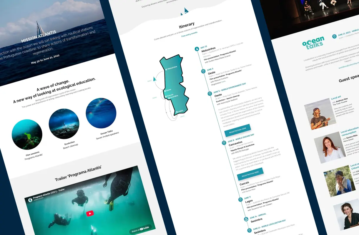
The website structure was designed to turn a broad vision into clear pathways — from aquatic journeys to educational experiences and ocean-based practices.
Solution
An identity that invites you to go deeper
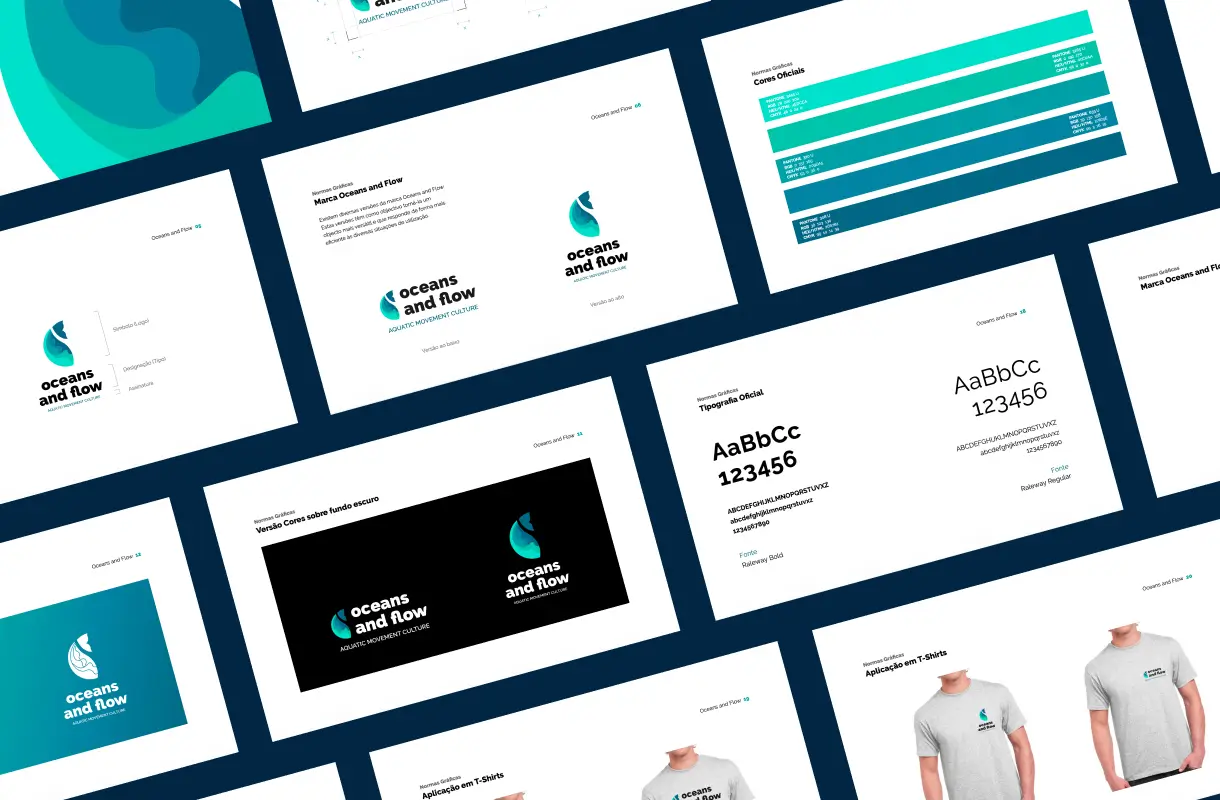
I created the visual identity and website around the idea of diving — into the ocean, and into the parts of ourselves that often remain unexplored.
The symbol expresses the connection between the ocean and the life within it. Organic, flowing forms suggest movement, depth and a living ecosystem, while serving as a metaphor for the inner exploration at the heart of the project.
Online, this visual language became an experience combining imagery, movement and space, preserving the sensory character of Oceans and Flow while keeping information clear.
The result is an identity that brings together the project’s different dimensions — travel, aquatic movement, education, nature and ecological awareness — through a shared narrative: bringing people closer to the water, the ocean and themselves.